Is your site mobile-friendly?
Is your site mobile-friendly? Ask webmasters this question and you'll get plenty of different answers. Ask Google and you'll get one, a yes or a no. Does this matter? Absolutely! The comScore report we discussed previously offers some insights into user behavior. Among them is the fact that 60% of web traffic now comes from mobile devices. You want your site to look great no matter what device users are accessing it from. That's why we here at Ellanet use responsive design to ensure that your site will look and work great on mobile phones, tablets, laptops, desktops, and anything else that can access a website! Now Google adds an additional reason to make your site responsive.
Google Search now indicates whether or not a site is mobile-friendly in the search results it serves to mobile devices. Given that each of these users is a potential customer you want to make your site as attractive as possible to them, and the mobile-friendly indicator is a great way to do this. There is no indication that this helps your site in search results at this time, but it certainly can't hurt and there is every possibility it will help in the future.
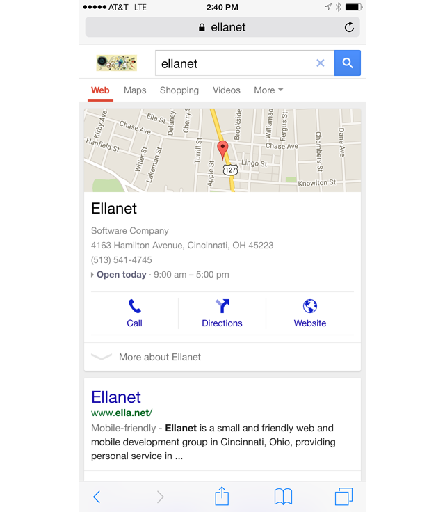
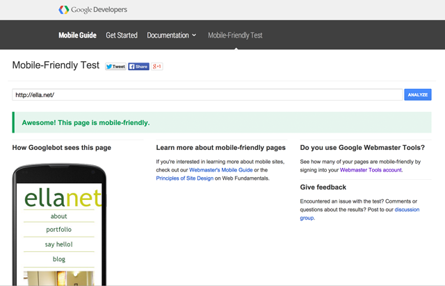
So, how can you tell if your site is mobile-friendly in Google's eyes? Google offers a free tool at https://www.google.com/webmasters/tools/mobile-friendly/ to test your site. So go ahead, test your site, and for good measure test a few of your competitors, then let us know if we can help make your site mobile-friendly and help you capitalize on the growing amount of traffic coming from mobile devices. Back to blog news...
 Call us: